Starting in January with a visit to The Oklahoma City Cowboy Museum, I’ve been trying to add visits to see other artist’s work. Just this past week we stopped by Inspiration Gallery and other galleries in Fredericksburg, Texas. Both had no watercolors on display. I should say all 3 of these carried bronze and clay statues and 99% oils, all Western themed as well. I did chat with the knowledgeable staff and they assured me that watercolor is well liked….but doesn’t sell. They brought up the difficulty with glass covering the artwork which is actually no longer an issue. We now use acrylic or plastic glazing almost exclusively or protect our images with wax or a fixative. It is a dilemma for watercolorists despite some fabulous artwork coming from amazing artists even in my home state of Texas. Let’s talk this out and see if we can uncover some of this negativity.
Size limitation: Large pieces are in demand
Watercolor "paper" (actually cotton fiber) has been made for hundreds of years. Fabriano started producing it in 1264 and is still a leading, quality papermaker. It is expensive but also comes in limited sizes: a full sheet is 22"x30" but elephant (30"x40") can be found in limited supply and a roll can be purchased at lesser quality. There are varying shades of brightness and smoothness, also thickness. The most common weight or thickness is 140# but I far prefer 300# as it absorbs, lifts and keeps its shape so much better. I use Arches made in the UK and currently a 5 pack of full sheets is well over $100.
Canvases for acrylic and oil mediums are not as expensive and do come in a variety of qualities but the size is unlimited and can be as large as any frame can be built. BIG is appealing to art collectors and decorators which is something we can't easily provide.
Glazing: Watercolors must be protected
In order to prevent damage caused by bending or wetting any watercolor painting, a protecive layer is needed. Originally glass was the only option with a variety of tints, glares and UV protection andf a weight plus fragility that caused issues. Today, there are many options that are less fragile and weigh decidedly less: acrylic glazing, waxing and a pored coating. All of these have become accetable to the two maajor decision makers: American Watercolor Society in NY and National Watercolor Society ( the oldest) in California. Can we all say Yeah!!!!?
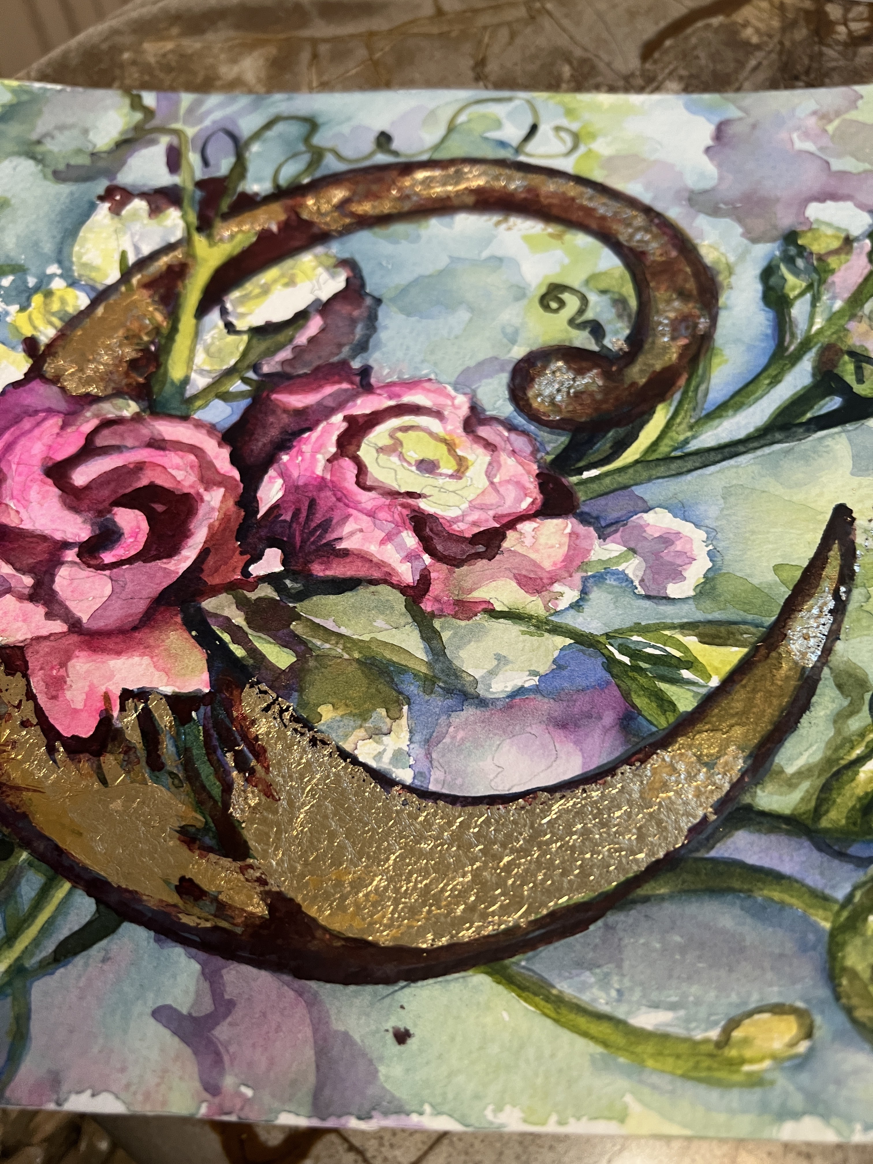
Misconceptions: Can you tell these are watercolors?
Some people (in general) assume watercolors are a prelude done before an oil is used. Or that they are all watery flowers painted with a delicate touch. Let me assure you...not any more! Some of my favorite current headliners in the watercolor medium paint with a wide range of subject matter and a richness of color and detail that is similar to oils. I'd like to show you three of today's leading American watercolorists: Laurin McCracken, Soon Warren and Lana Privitera. These three are the current top notch award winners, guest speakers, jurors and teachers internationally and are touted by the paint companies, brush makers and paper companies much like star athletes who promote Nike and Adidas.
Soon Warren has an ability to exhibit reflection on foil and glassware that is hard to believe.
Laurin McCracken is a trained architect whose attention to detail and signature black background is comparable to the Dutch oil painters in the 1600's. Daniel Smith recently introduced McCracken Black as a pigment and it is wonderful!
Lana Privitera is capable of reproducing and ordinary scene with emotional quality and exquisite handling
Abstraction/ Abstracted: Again, this is a popular style and yet, often watercolor is not considered. Yet here are two abstract watercolorists, Carol Carter and Beatrice Baldwin
Beatrice is a local Austin educator and artist with a whimsical touch and a message.
Carol Carter enhances the water's properties with her own creativity for spectacular outcomes:

I would like to suggest a new category as these are not totally realistic or abstract portrayals but , by design, abstracted views of portraits, animals, landscapes and architecture.
Value: We do a poor job of valuing our work as compared to other artists. It takes a big ego to realize you have created something of value and it is often difficult to price. If sold through a gallery or other art promotor there is often a percentage taken ( as much as 50%) and often the artist simply eats it. As a rule, watercolorists tend to give their paintings away. They utilize an exclusive frame and charge what they paid for it. Why? I think every artist should visit galleries and see what is being asked for in the way of compensation. Certainly commissioned work is often better compensated but it is somewhat like surrogate mothering, made by you but not your baby.
Some artists are late bloomers and have never bought art before deciding to paint.
Instead of determining price by how long it takes to complete it, I go by size. A full sheet ( 22"x30") should be $500 at a minimum. Even that is undervalued. Frames , which are yet another piece of art, for that size painting are often $500 as well. Should the frame cost more than the artwork? I don't think so. Something is wrong with this formula.
Conclusions:
The Current climate: Big, abstract and expensive are what collectors want. So....it reeally is this simple if you want to sell your Art. Even if you paint realistically, use the largest paper available and in some way abstract colors or shapes to appeal to a broader horizon of people. Select unique, high quality framing and then put a fitting price tag on it. Be represented by an actual gallery that promotes your work if you can.
Did I also tell you this should not be your only source of income? Did I have to tell you that?? I think it starts with the artists to change this non progressive attitude. And we can , we must and we will turn this around!
Please leave a comment or suggestion. I'd love to hear from you.