Monday, September 7, 2020

Poster Art is on my mind....


  I  decided to take a closer look at advertising art. It uses color and bold shapes, borders and lettering to entice us to attend or want more of a certain subject. Along with bold colors, different sized pen nibs are also used to outline and dramatize designs. Motion Picture Studios have a long tradition of using their images to persuade attendance to upcoming movies using posters. and offer a lasting snapshot of the actors and maybe a scene or two. It’s also a great collectible. Many a home theater, college dorm room and early apartment has been decorated with these favorites.   

Lettering  has long been a favorite study of mine. I learned several calligraphic alphabets over the years and have used the wonderful families of majuscules and minuscules of our 27 letters to create my own stylized alphabet. I encourage the use of this skill especially if you don’t like your own hand writing...you can do better! 

The first poster will focus on the Texas music and wine scene that is alive and well  in the small town of Gruene ( pronounced GREEN). A water tower, a river and several old dance halls ( including Gruene Gall, the oldest in Texas) mark the spot where many come to party and dance or just walk around enjoying the local sights. The music is first class country and the wine offers all varieties from local wineries. This year, due to Covid, will be virtual and will benefit United Way.

This sketch was my first pass at the design. I anchored the upper left and lower right with a swirling confetti that just looks like fun. After masking with Pebeo masking fluid ( blue lines) , I created an underpainting. Lots of bright Hansa Yellow, Quinacridone Red and French Ultramarine Blue were thrown on sprayed areas , then blown with a straw and splattered. The river is a combination of Cobalt and French Ultramarine Blue. I used Elegant Writer pens with various nibs to create a black edge in places while continuing my color processes.

Something about the bucket of wine in the bottom right looked too busy so I did change this and repainted with the following result:


Still...I thought a musical ribboned border with catch phrases suggesting fun and giving for this excellent cause

So much fun and hopefully a donation item!

New discovery: white pens that actually are strong opaque accents can be used effectively with watercolors. After trying several I settled on the Uniball Signo (broad) made by Mitsubishi and readily available at Michael's. 


New technique?: Round Rock Arts Downtowner Gallery asked for our group to video a demo using wine as our medium. Here is a link to YouTube to see my effort which was also presented at a Waterloo Watercolor Group Meeting in early August.
                                                                    Cheers!


https://ms-my.facebook.com/RoundRockArtsCouncil/videos/painting-with-wine-by-artist-carol-sue-witt/2703246303252026/


Friday, July 10, 2020

Summertime...is apparently an "Ideal" time to paint in watercolor!


Sometimes it's just the simple scenes that are the most fun to paint. But let's be honest, this Ball jar vase with cut flowers (painted by another artist ) offers some complexities. That is what makes it an excellent project for a watercolor painting class. Not only do we have the background to create, but also water, stems, leaves and petals and a reflective glass jar. We have continued to use a Zoom class, as we are still social distancing, to create our end of June floral. Everyone was provided with a color and BW version of the image and instructions to have the scene sketched and masked before our class. I want to mention that there were 9 in attendance , including a family member,my daughter in law, Anne, and they ranged from new to watercolor to advanced painters just wanting to try some new techniques.I was especially pleased to have my longtime friend and fellow artist, Sue Rinker, primarily an oil painter join us for a little fun with another genre. 

 I usually demonstrate how to paint each area as my artists take notes or paint along. As each person completes their painting and sends it to me, I will add it to this blog.

Here are the images sent to each painter:
      Masking fluid ( Pebeo) is in blue and is used to save the white or lightest highlights.
 
  A Color copy is for reference
 Ideal...by the original artist


A masked sketch was homework for each artist prior to our class


A black and white copy is an easy value study and the most important road map to obtain 5 values.


We have a vocabulary list that is added to during each lesson and for this class, we covered the following as the background requires an understanding of watercolor washes::

Vocabulary

Wash: an area of paint applied to paper in a smooth, uniform zone or a subtle, changing tone

.Can be difficult (so practice these): used for backgrounds, sky, water scenes, mountains, sunsets, etc)

.Can be done on dry paper or wet in wet; I usually tilt my board to 30 degrees ; use a wash brush with an even horizontal stroke most times; make a puddle of enough of the color you are using

Graded: Darker fading to lighter in the same color

Flat:   Same tone and color throughout

Variegated: Gradual change from one color to another


Because our time was limited to a 3 hour session and the reality was that this particular painting would be completed on their own, I provided the following suggestions:

We will be using a variegated wash for the dramatic background of this Ball jar and flowers. As always, our goal is to have 5 values from white(lightest) to darkest value.

1.     Wet your previously masked page with clean water

2.      1. Using Hansa or Lemon Yellow place the undertones throughout your page

3.       Divide your page in half vertically and start in the upper left (darker) corner , working down that left side of the Ball jar. Instead of a horizontal stroke, use a more vertical pattern to obtain the look. We will use Permanent Rose and Cobalt ( and more yellow if needed) working wet in wet. You may come back later to add more darks.

4.      2. Moving to the upper right , mix orange ( permanent rose and yellow) and again work top to bottom using cerulean for a lighter dark

5.    3. Use quinacridone gold in the center of the Ball jar moving outside the edges. Begin the leafy foliage with mixes of sap green and yellow.

6.    Remove mask when all has dried.

7.    4. Create the metal edge of the handle and hardware with cerulean and burnt sienna and the lettering in cerulean and titanium white ( if needed) using a rigger or liner on dry areas. This is done with your rigger or liner anduses a calligraphic stroke.

8.    Begin adding your darks as needed ( French ultramarine and Prussian work well). Also Alzarin and cobalt for a rich dark red.


9.    5. Save the flowers for last: use #8 or# 10 pointed round:


Yellow flower: A milky base of quin gold or Hansa using a pointed round for the petal shapes ( follow their natural direction), adding permanent rose on tips and in darker areas for variation while wet.


Mauve flower: Permanent rose and cobalt or purple if you have it . Same brush strokes


6. Finish by adding your darks and lifting hard lines you don’t want…splatter the background with water, if you like.

 Enjoy!!

 I am always amazed with the outcomes. 

Here are a few finished images from two attendees,  Ron Weidmann  (Centennial, Colorado) and Susan Rinker ( Frisco, Texas):


Debbie Lauderdale, Austin, Texas


My advice to you and all who are creating an artistic point of view for others to enjoy;

Know the rules first, throw out the ones you don't like and paint like nobody's watching!


Tuesday, June 23, 2020

"Peonies" and "Fresh Cut" ....May and June 2020 Watercolor Wednesdays

Peonies ( continued)

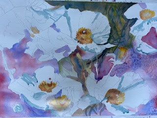
Well, since the pandemic is keeping us at home for awhile, we decided to continue meeting this way. There is a value to having more time to absorb the information and paint. Our May class, as usual was a combination of beginner and advanced watercolor artists  local Texans and also from Colorado who completed this lovely artwork. We did an under painting using 3 colors: Hansa Yellow, Permanent Rose and Cobalt Blue as well as salt for texture before defining the leaves and stems, later soft petals and centers. The outcomes were all good. I suggested note cards ( easy using Vistaprint,  Shutterfly and other online sources ) and I am happy to say some went forward with this idea. Here are my notes and images.


    A transfer sketch was made available to all painters using a grid


    The softer blue lines are Pebeo masking fluid ( my reco)


After the background was added, we got up close and personal with our darks to make the white petals pop.


My completed painting:


June work shop "Fresh Cut"

   Using my reference photos of a colorful flower shop taken in Aptos, California in 2019, we created a very easy value study by copying this in B/W. Both were used for decision making during the class.


We used complementary colors and our goal was 5 values in this painting. We tried to convey 4 textures: stone, water, tin and living plant material with one medium, watercolor.


                             10 values from white to black

     Transfer sketch ( sign or not) was easily done on any size paper. 11 x 15 is most popular due to over the counter framing capabilities.


And here is our distinguished online Gallery of completed paintings:

Please notice choices of color, additions and deletions, heavy and light applications of pigment and.....personality. The teacher, as always, learned from her class!

 Monica Donna


Sue                                                                                                Debbie


                                                                                                                                                  Carol                    


Rene                                                              Georgia


Lu
                                                                                                       Mary                            
Please join me in congratulating these artists who have managed to convey a lively scene filled with a variety of textures and values. Leave a message for an artist here and feel free to share.


Sunday, May 10, 2020

Art while social distancing Zoom, Zoom...welcome to Spring 2020

I was planning two exciting work shops. One as the featured watercolor artist in Bastrop, Texas at Lost Pines Art Center during a long week-end in March and the other in Marble Falls in early April. Both had nice sized classes arranged and I was prepared when ...oops!  along came a pandemic. There go the best made plans and those preparations were no longer needed. Eventually both events were reluctantly cancelled along with two planned trips, one to Nashville and one to San Francisco.  Needless to say, everyone's plans were changed! That, as it turned out, was the least of our concerns. Many were afflicted and died, many in the healthcare industry became beyond overworked, many lost jobs, many ( who knew?) were living on the brink and required immediate assistance even with their next meal. No schooling, no graduations, no airline travel, cruising is OUT....it all ground to a complete and lengthy HALT. Grocery stores were wiped out, toilet paper and meat now rationed and smog lifted from the skies due to a lack of emissions left the air in its best state in decades all over the world.  No cure, no real rhyme or reason but corona virus, Covid 19 has taken over. Thank God New York had Mario Cuomo leading them as they were hardest hit. Turns our high rises and mass transit may not be best. We are just now testing the waters of reopening but this has changed forever how we will do things....

For those of us who simply had to stay at home, wash hands and not touch our faces, this has not been as horrendous.  We can take a walk in the fresh air, read books, stream movies and gain weight. But we do have whiners who don't want to wear a mask, including our Vice President (?????) while at the Mayo Clinic no less! But lets wish them well in Washington because our lives literally depend on them. And let's look on the brighter side:

1.  I  was quick to volunteer to teach an art class online via Zoom in late March to my 3rd grade grandchildren, Ella and Gray,  in the Bay Area. The class size quickly grew to 14 at times with classmates and their siblings joining in. We are currently ( week 5) working on a book that will be written and illustrated by each of them. Lots of fun on Fridays. Hopefully their books will be lifelong reminders of this time.


2. My friend and owner of Art School Marble Falls , Debbie Heatley, asked if I would like to teach my work shops online also via Zoom so we divided the normally 6 hour day into 3 Watercolor Wednesdays  per month and had some different interaction. The pros of this are that each student has the entire week to work on their paintings before we meet again.


    Barns, Bluebonnets and Babies....featuring Speckles and her calf was painted on April and we are doing a floral in May.


Using a favorite published procedure, I added some shapes and colors to this lovely poppy painting. Thank you , Lu, for the images of your longhorns.

                                         
and here is our May floral , Poppies:


                                      Graphite transfer for 15 x 22 Arches 140# paper

                                          Masked areas

First wash for background war Permanent Rose and French Ultramarine by Daniel Smith.

                                                    Stay tuned for the finished product.

3.   And last but not least, I qualified for entry as a signature member in Texas Watercolor Society! The show is being held in Ingram Texas but is available online at www.texaswatercolorsociety.org. I am so honored! Juror Judi Coffey selected my entry
 " Low Water Crossing" to be shown along with 38 other artists. All my future works will have TWS proudly displayed after my signature.


Please visit my Etsy store, Watergirl Art for in stock prints from me or have all sizes and even canvas prints of my art made at Fine Art America!

                                                                             Be well!

Thursday, March 19, 2020

We can learn from Mother Nature! ...Meet Lady Bird!

Just when I thought I was making plans for two work shops, along came a global epidemic. Let me first apologize to my eager beginning watercolor students who got halted in their tracks! The conference at Lost Pines Art Center will go on this Fall as will the class at Art School MarbleFalls but I’m encouraging you to jump in before then and try some of my online practices through this blog. We can communicate and discuss until we meet in person....and it’s free from me to you. The supplies will cost you but all can be purchased online and delivered to your door. Be sure to contact me. The February blog has instructions for “ Texas Roadside Beauties”. My April blog will be devoted to “ Barns, Bluebonnets and Babies”.

In this crazy time period of social distancing, and more, one thing remains perfectly unchanged....blue skies, chirping birds and spring blooms are everywhere! I don’t know about you, but it makes me want to grab some of that resilience that occurs each Spring even after the hardest winter and use it to get through this time period. I am going to do some cooking, some reading and movie watching (and much needed reorganizing), but that cannot be my main focus.  So I plan to be outside enjoying as much of it as I can and I am also issuing a challenge to you to paint along with me.

My first coronavirus challenge is to paint this beautiful and complicated nest constructed by one hard working genius bird. It’s like the Taj Mahal of residences and it deserves some scrutiny and applause.
The bird is very cute, too!
 The photo was taken by my friend, Gerry Russell, who, luckily for us, observes nature with her
camera. Thank you, Gerry!


Lady Bird and her condo...

My suggestion is to print this photo out in color and black and white. The black and white will serve as a readymade value study at your side and that comes in handy for decision making. Be sure to put the bird off center and make sure all 4 sides of your paper offer a difference. Plan ahead to make the
 top of your painting warm and the bottom cool or vice versa.


I used an 11x15 piece of 300# paper and marked off a border so it will fit into a frame I have on hand.
I’m already planning to frame it ( I’m an optimist). I free sketched the bird and nest horizontally but
 feel free to choose the size and orientation you like best. I masked several of the stems and sticks that
dominate the pattern. Next I sprayed water and dropped in local color, Hansa Yellow and Sap Green
with a little Cobalt Blue in the darker areas of the nest.


This is the prepared start of the nest


Notice I left a border on the page and I also saved the background for last. My order is the nest, the bird, then the background. I painted this within a one day time frame. I started with quinacridone gold and some darker browns like Sepia to begin the tangle of straw that holds this nest together. Talk about genius....every color known to Nature was already here. My task was simply to decide which ones to promote. I definitely kept a softer approach as I identified perfect areas for negative painting as well as alternating patterns of the sticks and branches. I used a beautiful mix of Prussian Blue with
 Raw Sienna for some of my greens and a little Quin Red helped to   darken the area that serves as the
 entrance to the nest ( behind Lady Bird) so I also put some in the sticks of the nest.


Here is a little more detail. Now for the Bird. Not that she isn’t important but her house is like a mansion so I wanted her to be softer and maybe a little less in focus. Still, you tell me, I think she stole the show!  I used Cadmium Orange to feature the breast and then added it to the nest as well. I later added the soft background using Cobalt blue and Windsor Violet to pull out my blues in both the bird and the nest.


Enjoy, share and be in touch with Nature...and with me!
Warm regards, Carol Sue


Tuesday, February 4, 2020

Winter Work Shop and my new store...

Galleries at Pecan Creek in Marble Falls was once again my choice for a one day work shop. Debbie Heatley is a great organizer and I love joining forces with her at her studio. We had some returnees and also 5 brand new artists who jumped in to try a new method. I provided the sketch on 140 # watercolor paper for each artist.
Here is our completed image in color. A black and white copy is a time saving value study which is always recommended. The instruction sheet also reminds us of our order in this process and the colors and tools we used.

                    "Deer Me, It's Winter!" 


Creating a watercolor tapestry                     

This is an ambitious project to try to complete in one day. I do NOT want you to rush or feel hurried by my instructions. You will be able to complete your painting later after today’s instructions. So relax and enjoy…
Welcome to a new level of watercolor that employs an under painting, cool winter colors, a richly detailed background and some use of negative space….oh, let’s add calligraphy, too! All of our final products will be different. 
I used cadmium or lemon yellow as they seem to have more green in them as compared to warmer yellows that seem to have more red. My red was Quniacridone magenta which is pinker and I used F   
1. Using your provided sketch of “Deer Me… It’s Winter”, begin by masking out areas you want to preserve. This is often your whites ( but not limited to that) and I will give you the choice of splattering your snow with masking fluid using a toothbrush now or using Titanium white afterward to splatter it. Suggestion: mask the deer (our warm focal point). Remember that any living thing always steals the show in a painting.

  2.   Under painting:
Let’s start with the sky and work down being mindful of the local colors you want to promote. Only spray the areas that you are currently working on. Have a straw handy and a Kleenex for mopping. Be creative…remember it all dries lighter and transparent colors form a richer glaze this way. Dry completely. We will use dryers although I prefer air drying when you have the time. Colors used: Cobalt blue, Hansa yellow, quinacridone magenta.

   3.    Sky, Evergreen and Bridge: I used a pointed round brush to apply several dark greens ( Sap, permanent and evergreen) to the tree sections. This tree is a second focal point as is the bridge and they both define the background so are quite important. I used burnt sienna and my cool yellow to create the bridge. It’s ok to use a “dark” ( sepia)

    4. Waterfall and frozen pond: This area alone can take all day so just get the rhythm going and repeat values to be continued later. Lots of blues ( French Ultramarine and Prussian)  and purple define the negative space here. I also pull the pinkish magenta in whenever possible. Really use your balack and white value study here as a road map.

     5. Deer/ Elk: This guy is the focal point in the painting so take your time, don't feel like you have to color him all over; just suggest his muscle shapes as you go and define his neck with shadow. Hansa yellow, quinacridone gold and burnt sepia all in a wet application.

    6. I suggest leaving this alone for 48 hours after class. You need some space! When you have time later, begin evaluating where you need darks and how to bring everything into focus.
   
****   If you do nor have enough snow when you reach this stage, cover the deer and splatter white using a toothbrush. This can be titanium which is a gouache or it can be a white acrylic. Let is all dry completely.

                                 Congratulations!!! 

Here are some of our paintings at the end of the day:


We will be painting a pasture scene with bluebonnets, barns and cows for Spring. Stay tuned for more details.

AND...please visit my Etsy store 
WatergirlArt
www.etsy.com/shop/WatergirlArt


Saturday, January 11, 2020

Let’s start 2020 with some new ideas!

Hi, all! What a wonderful time to be painting ...especially if you want to grow in the Watercolor Medium. We not only have more super colors, better papers and great current artists to help us get our thoughts on paper but we also have new ideas about old “absolutes”. For example, if you were told, as I was, that pure sable brushes which are extremely expensive are THE BEST, look out for all the synthetic hairs that are taking over. The ability to hold paint and moisture and keep a good Point has been challenged and guess who is winning. I’m recommending you consider the synthetic brushes made by the quality brush makers such as Escoda, Windsor Newton and Black Silver. Their signature lines have won me over. My new favorite go to brush is a pointed filbert by Escoda. Love this brush!

On a personal note, I just handed over the reins as President of Waterloo Watercolor Group in Austin after a 2 year run from 2017-2019. It was an honor, never a nuisance and got me out there to many more shows and galleries than I had been visiting. Great group, great experience.

Next week I will be teaching some interesting techniques using my original painting “ Deer Me...It’s Winter” to a group of artists , many are repeat students of mine, in Marble Falls at Galleries at Pecan Creek. My vision for this was created by using cool transparent colors in an under painting and using negative space to create the tapestry like background for my deer. The palette includes lemon yellow, quinacridone magenta and French ultramarine blue. Lots of masking helps this and a splatter of titanium white mists the background to push it back.

We will also use some calligraphic strokes to make the upper branches that are bare this time of year.
Here are my images used to create this scene. Some say this is an elk....but that would not work with my title, right? 😉
                                                          The images I used:


The transfer of my sketch and my first wash ( I am not really a photographer...)


This is my final result but theirs will all be different. I will share them. Don't tell anyone but I learn from all of their work!
Deer Me....It's Winter!
Whatever you do, stretch yourself and try something new. No harm done if it’s not for you but I’m guessing it will change your outlook and your outcome in a very positive way.

Also, look for my next work shop ( March 21 in Bastrop at Lost Pines Art Center) and a big announcement in my next blog and on my Facebook page, Carol Sue Witt Original Watercolors.

Happy painting! And happy Winter!
Carol Sue


Zoom 2020

Have you added illumination to your watercolors?

 A little sparkle and shine can be a great addition to the normally dry and flat finished look of your watercolors. There are several techni...