
Jump Start your watercolors....and more!

Notice: Waterloo Watercolor Group has rescheduled my live demo of this process that was to be aired on Thursday evening Feb 18th due to severe utility outages in the Austin Texas area . I will post the new date as soon as it’s available. 

 Jump In......

If you haven’t tried creating an underpainting for your paintings you may be missing an opportunity to enrich your colors , loosen up and/or get out of a slump. This method is not new but it escapes some beginners as well as advanced watercolorists because a) it’s scary b) you do give up some control and c) it’s not the way you usually start your paintings. Guess what? Those are all good reasons to try it. How else will you grow? It literally jump starts your creative processes whether you had already sketched a scene or you were not sure what to paint.

I was first introduced to a 3 color underpainting at a workshop given by Lian Quan Zheng in 2018. We actually painted this entire painting with just these 3 colors: Napthol Red, Hansa Yellow and Antwerp Blue. The key is their transparency as it allows the mixing and layering to occur resulting in a rich glow of hues. The transparency of a color is available on the tube and on the manufacturers website. I used a mix of brands but rely on Daniel Smith colors.  

My normal pattern had been to start a painting at the largest area like the sky in a landscape scene. Or I started at the top with a graded wash and worked down the paper for my first glaze. And my paintings were just fine. But I wanted to try some new tricks and this one has literally changed how I paint. I hope you will let me share this technique with you.


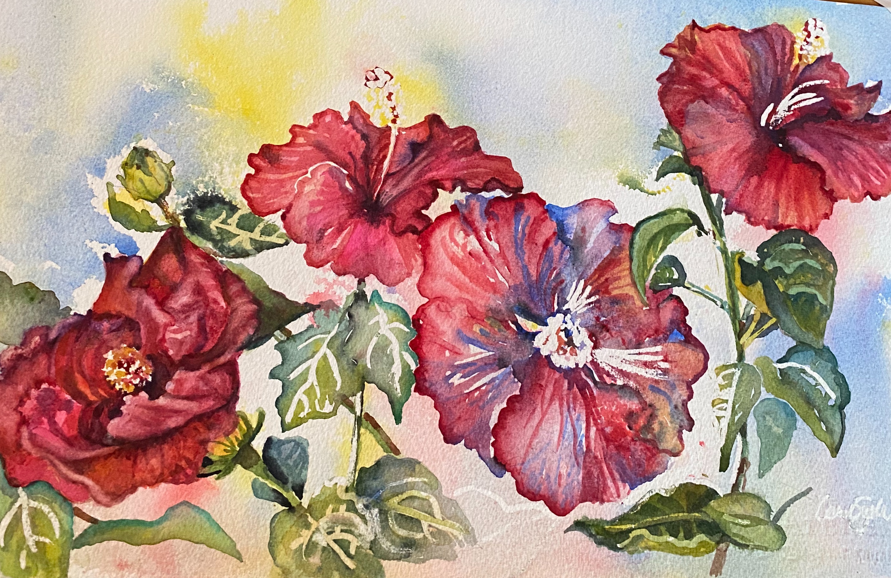
Let’s recreate my painting “ Hi Biscus”. This is my completed painting and one of my many reference photos taken from my back porch. I love these gorgeous plants! 

                                 
 If you follow my blog, you know I print a BW and color copy to refer to as I paint. BW creates an easy value study; I am all about shortcuts if they work.                                                        
The blooms, buds & leaves all had their own prominence in my design. I also chose to leave most of the obvious mask lines which are rather hard rather than soften them. They created a nice rhythm throughout the painting.

Working backward here are the tools I used:

11”x 22” Arches 140# paper taped

3 transparent colors (red, yellow and blue). Permanent rose, Lemon yellow and Prussian blue

3 brushes, 3 droppers

3 bowls, 3 stirrers

1 spray bottle

1 straw or atomizer

Masking fluid , if desired

I sketched my scene and masked ( blue lines are Pebeo masking fluid) a few spots to preserve the white of the paper . You do not have to do this but if you are quite sure of placement and values , as I was, this is a needed step. Not only do I have a ready made background for my floral but I also have beautiful patterns to play with in my leaves, stems and petals.


As I started painting, I played with each petal, stem and leaf separately to play up these lovely undertones.


This start is a very satisfying way to prevent you from staying in your comfort zone! You can’t control the outcome and that is a good thing. And there's no worrying about how to handle the background...it's done. 

 Here are a few more starts and finishes done in this manner:
This one is titled 
Jump in, the Water’s Fine”

I sketched and masked this lighthouse scene and used the underpainting to help create rhythm and color in the water, rock and lighthouse. I held a very fun work shop using this scene and all attendees were pleased with their outcomes. Of course, all different because this is not possible to copy. It’s an individual, unique happening.


                                                                    “Snip, Snip” 

I was inspired by a basket of scissors I found in an antique shop in Fredericksburg. The underpainting really changed my game plan and it was a delightful experience that earned me a first place award in a Waterloo Watercolor Show in 2020.

I think you can see that my 3 colors were changed, they simply need to be transparent so I used violet as my red. Violet already is a combination of blue and red so this was a purposeful maneuver. I did add quinacridone red on later glazes.


"What a Beautiful Sight..."


I hope this inspires you to start your watercolors in an exciting new way. I think you’ll enjoy it!

Now for a promised announcement of my next workshop: it will include the jump start you have just seen with 3 different transparent colors. It will be titled           "Catch a Wave” 
and will be held on March 10, 17 and 24th. These are my Watercolor Wednesdays and classes are held via Zoom from 12:00-2:00 + CST
This is the reference photo.  We will paint together but you have a week to accomplish what I demonstrate. Individual email critiques are included from me. I will provide a supply list and more details. Let me know if you would like to join me. Cost is $45


Comments

Popular posts from this blog

Why are collectors not choosing watercolors? Let's explore that and change some misconceptions

  Starting in January with a visit to The Oklahoma City Cowboy Museum, I’ve been trying to add visits to see other artist’s work. Just this past week we stopped by Inspiration Gallery and other galleries in Fredericksburg, Texas. Both had no watercolors on display. I should say all 3 of these carried bronze and clay statues and 99% oils, all Western themed as well. I did chat with the knowledgeable staff and they assured me that watercolor is well liked….but doesn’t sell. They brought up the difficulty with glass covering the artwork which is actually no longer an issue. We now use acrylic or plastic glazing almost exclusively or protect our images with wax or a fixative. It is a dilemma for watercolorists despite some fabulous artwork coming from amazing artists even in my home state of Texas. Let’s talk this out and see if we can uncover some of this negativity. Size limitation: Large pieces are in demand Watercolor "paper" (actually cotton fiber) has been made for hundreds...

Merchandising Your Art

"Dairy Queen" If you have lived in Texas, you might love Blue Bell. Even our cows do.  I hope you have considered merchandising your images. Not only is it fun to see products with your artwork on them but it is lucrative and makes a longer lasting impression of your intention and talent. It's a great gift from you, as well. Where can you get this work created? One artist website is Fine Art America. I let the people at Fine Art America print my images on notecards, prints of all sizes and on surfaces of all kinds. For example, tote bags are a popular item. Many folks aren't collectors of hanging art but they like color and uniqueness in other areas of their homes. Mugs are  another popular item because they are practical and inexpensive as a gift. You can include beach towels, tapestries, masks and notebook covers and more. Pros: It doesn't cost much, (I set my own prices) and it is working behind the scenes making income for me. You can order personally from he...

I'm dreaming ...that we send our artwork as a gift to friends and family!

"I'm Dreaming..."is my choice for 2024 My inspiration was seeing some of our old family ornaments on my daughter's tree.  I hope this makes you smile!That is my message. Enjoy the happiest of Holidays!! PS  In case you run out of time, I merchandised this image on notecards, ornaments,  tote bags and pillows ...all are available on Fine Art America: carolsue-witt.pixels.com