Friday, March 20, 2026

Yosemite in the Spring...hard to imagine, wonderful to paint!

Can you imagine a warm, sunny day in March when you are fine wearing a sweater while snow still edges the shadowed side of things in this Valley? That is what you will find in this natural preserve that has been appealing to many visitors since it was found. Wear your sneakers because there's a lot of ground to cover. Bring your camera because you will want to capture the golden greenery, the rock formations  and the postcard blue sky. Even the sounds of roaring waterfalls are like no other experience...there is so much to take in and it's all around you.


This is snow!


This is a shadow


The sky is limitless


The trees are soooo tall


You can see forever


This is a visual course nature as it happens


That Gold/Green in the fir trees


Of course I have to attempt a painting so here goes.....starting with a yellow underpainting


It is my favorite mix of puzzle pieces and patterns. Here is my painting at about 70%


I will enjoy the beauty once again with my watercolor but it does remind me that it's hard to beat Mother Nature!


Sunday, March 8, 2026

Spring is here...rejuvenate!


Camelias are early bloomers along with daffodils and tulips at Filoli Gardens in Woodside, California...this is Spring! (Taken March 5th, 2026)

No matter where we live, winter has its effect on us. Plants lose their leaves, their vibrant color disappears and they basically hibernate. Days and daylight are shorter. Most of us stay inside more, wear heavier clothing and eat heavier foods. Then this phenomenon called Spring ( more sunlight? a few warm days?) awakens via a secret message to the world to wake up and rejuvenate. You can do the same.... get out and walk, go to a graden or nursery, trim the winterkill and plant some fresh shapes. Watch the subtle displays of color emerge all around you as the earth renews itself. And while you are at it, it's the perfect time to rejuvenate your paintings, Get busy!

I suggest uou start by taking a good look at your space and supplies. Clean and assess your brushes ( do you need a new one or two? Escoda has some well made keepers at a reasonable price) and studio area. Throw out the old paints and replace them BUT buy a few new colors too. I recommend the transparents and have added Winsor Newton's Aurelian to my tray of 18 favorites. It's warmth is unmistakeable. Do the same with your available watercolor paper. Try a new brand or size. I recently tried a less expensive paper by New York Central. It is not as coarse as higher quality Arches or Fabriano offers but it has a sturdy weight and allows a lot of lifting. It's perfect for your starts and may surprise you.

I bought a light for my drafting table that offers 3 colors to warm or cool the scenes. I love the ability to reposition it and actually see the colors better. And, because i teach in my studio several times annually, I bought some better chairs that are on rollers. I think these were much needed updates. But...do you need some instruction? Take a class in person or online.Wake up your craetivity with some gouache or inks. 

I also have a new method of titling my completed paintings as well. It's called "New Meanings" and here is one of them (shown unfinished) called " Pathology" (noun) def: the act of taking a path to refresh the body, mind and soul; a little play on words.


So, back to the camelias. Yes, they have inspired me! I am starting small but I am picturing these as much larger than life and it is awakening that little bud in me. Shown at 40-50%.


Wake up!! It's Spring.


Thursday, December 18, 2025

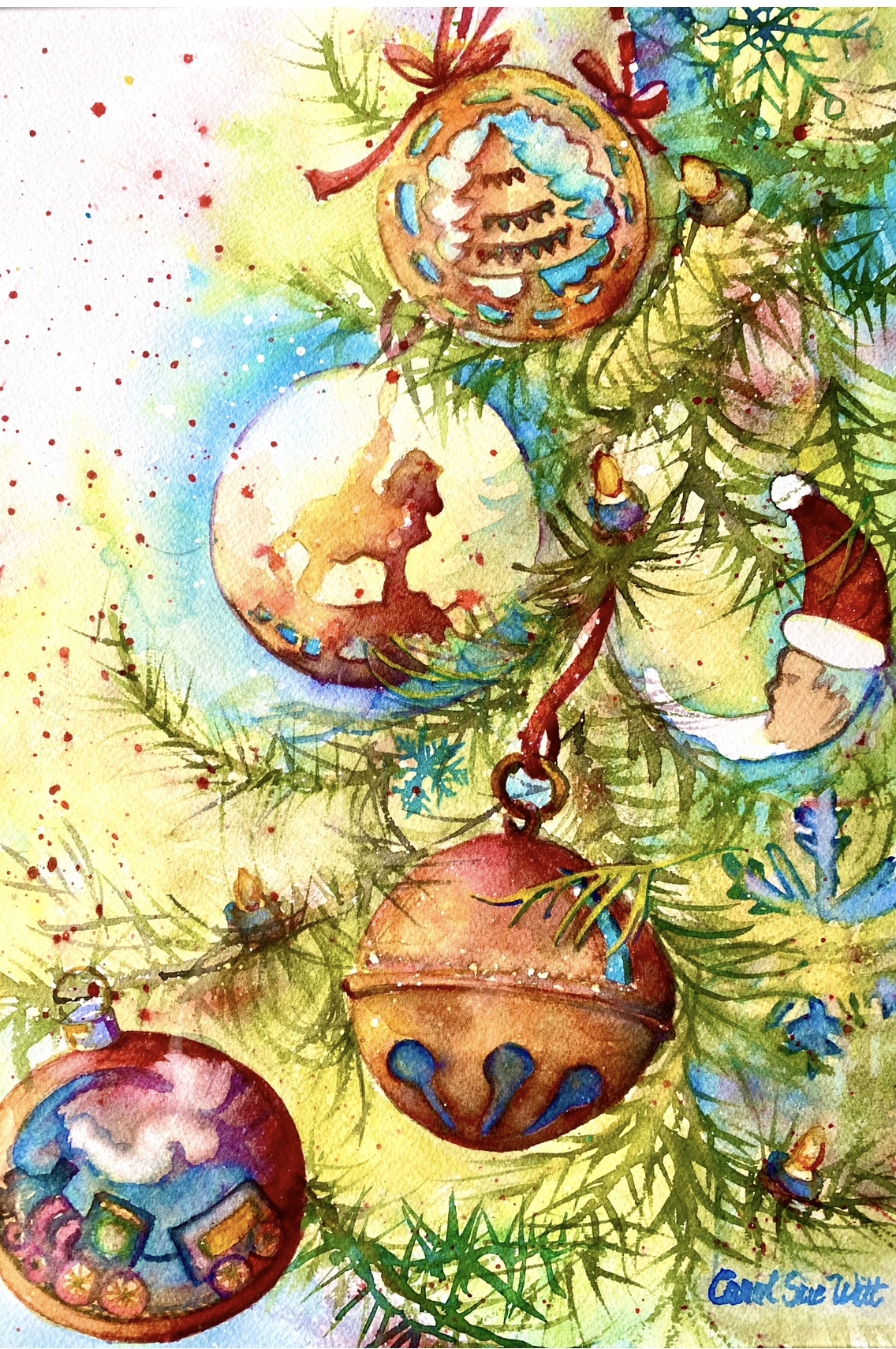
All Aboard for Christmas 2025!

  I love trains! Join me on the journey to Holiday fun with my whimsical "All Aboard"...


Send a nice greeting card from a store or take a family photo. All are worth the effort and cost to your recipients and the message is the most important part. But if you plan ahead, you can send your original artwork on a card. It's not that expensive and it shares a special side of you... your view of the world. Honestly, friends and family will look forward to your annual scene and it may be framed. A 5"x7" card fits into 8"x10" ready made framing so you are giving a gift, too.

I have been creating one for many years for my family but im proud to say I've also created the annual card for a friend's company, Weir International Inc, for 29 years!

Happy Holidays and Best Wishes for health and happiness in 2026 !!


Thursday, November 6, 2025

I am in love with Hydrangeas!

 Hydrangeas are amazing, fresh or dried, in an arrangement or as the subject of a painting. They are not easy to recreate so it's a bit of a challenge. Using many reference photos, I made my way through a month long journey this summer to attempt this. The end result is satisfying and incorprates some of my best efforts. Here are a few of my steps starting with these huge, healthy blooms from my daughter Leslie's yard. They inspired ,"Entwined" this summer.


I usually finish a painting more quickly than most painters, but not this time. I reimagined the background many times and can now see the value of that time. It was well spent!

Reference photo: early Summer in Pacific Grove, CA.


Steps:

I wanted a design that filled the page and also used my favorite palette of colors...Hansa Yellow, Green Gold, Opera Pink and Prussian Blue, All are transparent and play nicely together. 


I admit the leaves captured my favorite shapes and colors  (my favorite AND usual palette).


But can anything compete with Nature? Maybe not...


Wednesday, July 2, 2025

Have you added illumination to your watercolors?

 A little sparkle and shine can be a great addition to the normally dry and flat finished look of your watercolors. There are several techniques that create or at least imitate a shine. From varnished and waxed topcoats to tricking the eye to actually using watercolors that have a glitter effect, these all can showcase a wet surface or a shine on bird feathers or damp foliage...the possibilities are endless. And here are a few:

Water surface: using the movement of water by value change can give an appearance of shine and highlight.


Reflection on metal 


...and Glass


All of these "tricks" work but actually adding an inheritantly shiny item to your image steals the show. What we are going to focus on in this blog is using sheets of gold foil glued into your watercolor in a purposeful way. Much in the style of illuminated manuscripts from centuries ago, we will try to enhance with gold foil.I am following this YouTube artist , Theodora Gould, who shares her techniques and sells her products online:


I will use an already created alphabet to do our initials... just for fun at first. I do realize that this method requires patience and preparation...not necessarily my usual practice.😇 But I want to learn the process and use it in future works. I also want to share it with students.

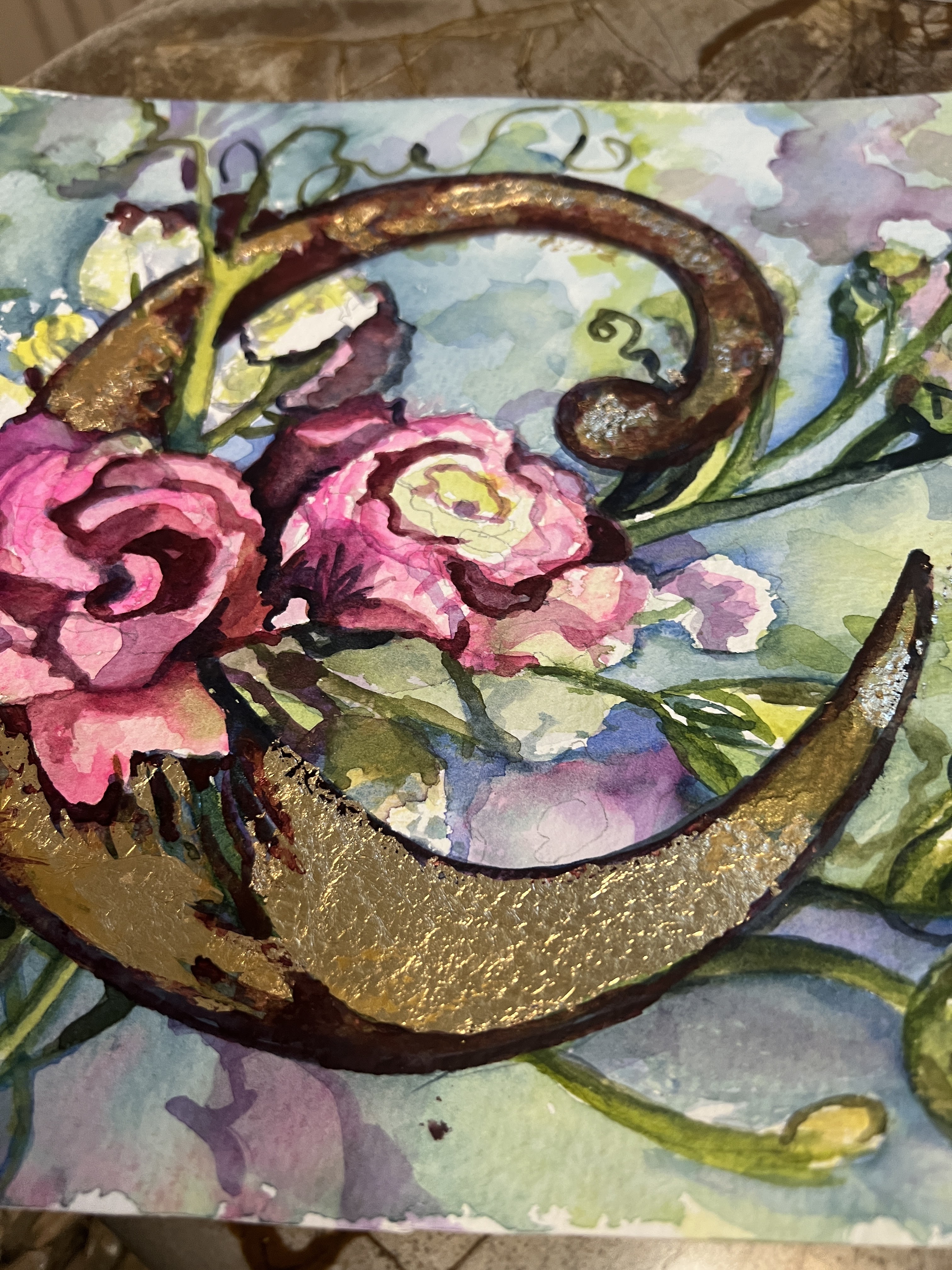
I began with an already painted floral and added the initial "C". 
Mistake #1:This is not smooth paper, 
I usually prefer rough texture so gold foil is not going to lie flat

Mistake #2: I used Mod Podge as my glue/ just don't

Mistake #3: I did not wait for the glue to get to a certain point before applying the very thin gold sheet


But, I actually like this look of old, bumpy illumination. I filled in the openings with watercolor pigment


Stay tuned for more of this fascinating process.


Friday, June 6, 2025

Why are collectors not choosing watercolors? Let's explore that and change some misconceptions


Starting in January with a visit to The Oklahoma City Cowboy Museum, I’ve been trying to add visits to see other artist’s work. Just this past week we stopped by Inspiration Gallery and other galleries in Fredericksburg, Texas. Both had no watercolors on display. I should say all 3 of these carried bronze and clay statues and 99% oils, all Western themed as well. I did chat with the knowledgeable staff and they assured me that watercolor is well liked….but doesn’t sell. They brought up the difficulty with glass covering the artwork which is actually no longer an issue. We now use acrylic or plastic glazing almost exclusively or protect our images with wax or a fixative. It is a dilemma for watercolorists despite some fabulous artwork coming from amazing artists even in my home state of Texas. Let’s talk this out and see if we can uncover some of this negativity.


Size limitation: Large pieces are in demand

Watercolor "paper" (actually cotton fiber) has been made for hundreds of years. Fabriano started producing it in 1264 and is still a leading, quality papermaker. It is expensive but also comes in limited sizes: a full sheet is 22"x30" but elephant (30"x40") can be found in limited supply and a roll can be purchased at lesser quality. There are varying shades of brightness and smoothness, also thickness. The most common weight or thickness is 140# but I far prefer 300# as it absorbs, lifts and keeps its shape so much better. I use Arches made in the UK and currently a 5 pack of full sheets is well over $100. 

Canvases for acrylic and oil mediums are not as expensive and do come in a variety of qualities but the size is unlimited and can be as large as any frame can be built. BIG is appealing to art collectors and decorators which is something we can't easily provide.


Glazing: Watercolors must be protected

In order to prevent damage caused by bending or wetting any watercolor painting, a protecive layer is needed. Originally glass was the only option with a variety of tints, glares and UV protection andf a weight plus fragility that caused issues. Today, there are many options that are less fragile and weigh decidedly less: acrylic glazing, waxing and a pored coating. All of these have become accetable to the two maajor decision makers: American Watercolor Society in NY and National Watercolor Society ( the oldest) in California. Can we all say Yeah!!!!?


Misconceptions: Can you tell these are watercolors?

Some people (in general) assume watercolors are a prelude done before an oil is used. Or that they are all watery flowers painted with a delicate touch. Let me assure you...not any more! Some of my favorite current headliners in the watercolor medium paint with a wide range of subject matter and a richness of color and detail that is similar to oils. I'd like to show you three of today's leading American watercolorists: Laurin McCracken, Soon Warren and Lana Privitera. These three are the current top notch award winners, guest speakers, jurors and teachers internationally and are touted by the paint companies, brush makers and paper companies much like star athletes who promote Nike and Adidas. 

Soon Warren has an ability to exhibit reflection on foil and glassware that is hard to believe.

Laurin McCracken is a trained architect whose attention to detail and signature black background is comparable to the Dutch oil painters in the 1600's. Daniel Smith recently introduced McCracken Black as a pigment and it is wonderful!

Lana Privitera is capable of reproducing and ordinary scene with emotional quality and exquisite handling


Abstraction/ Abstracted: Again, this is a popular style and yet, often watercolor is not considered. Yet here are two abstract watercolorists, Carol Carter and Beatrice Baldwin


Beatrice is a local Austin educator and artist with a whimsical touch and a message.


Carol Carter enhances the water's properties with her own creativity for spectacular outcomes:


I would like to suggest a new category as these are not totally realistic or abstract portrayals but , by design, abstracted views of portraits, animals, landscapes and architecture.


Value:  We do a poor job of valuing our work as compared to other artists. It takes a big ego to realize you have created something of value and it is often difficult to price. If sold through a gallery or other art promotor there is often a percentage taken ( as much as 50%) and often the artist simply eats it.  As a rule, watercolorists tend to give their paintings away. They utilize an exclusive frame and charge what they paid for it. Why? I think every artist should visit galleries and see what is being asked for in the way of compensation. Certainly commissioned work is often better compensated but it is somewhat like surrogate mothering, made by you but not your baby. 

Some artists are late bloomers and have never bought art before deciding to paint.

Instead of determining price by how long it takes to complete it, I go by size. A full sheet ( 22"x30") should be $500 at a minimum. Even that is undervalued. Frames , which are yet another piece of art, for that size painting are often $500 as well. Should the frame cost more than the artwork? I don't think so. Something is wrong with this formula.


Conclusions:

The Current climate: Big, abstract and expensive are what collectors want. So....it reeally is this simple if you want to sell your Art.  Even if you paint realistically, use the largest paper available and in some way abstract colors or shapes to appeal to a broader horizon of people. Select unique, high quality framing and then put a fitting price tag on it. Be represented by an actual gallery that promotes your work if you can. 

Did I also tell you this should not be your only source of income? Did I have to tell you that?? I think it starts with the artists to change this non progressive attitude.  And we can , we must and we will turn this around!

Please leave a comment or suggestion. I'd love to hear from you.


Saturday, December 14, 2024

I'm dreaming ...that we send our artwork as a gift to friends and family!


"I'm Dreaming..."is my choice for 2024


My inspiration was seeing some of our old family ornaments on my daughter's tree. 
I hope this makes you smile!That is my message.

Enjoy the happiest of Holidays!!
PS
 In case you run out of time, I merchandised this image on notecards, ornaments,  tote bags and pillows ...all are available on Fine Art America: carolsue-witt.pixels.com

Wednesday, November 6, 2024

Want to make a very unique statement? Try a wall mural...

 An outside covered entry with a stucco surface is a perfect spot to create a unique statement…and here is mine.


Wall murals were a popular decorating statement in the 90's...dining rooms, entryways and especially children's rooms were personalized into magical places using trick of the eye artwork. I was fortunate to be the right age and stage in my life to climb on ladders and fearlessly paint on people's walls. My confidence came from having the wall paint nearby for mistakes and having excellent partners in this endeavor both in St Louis, Missouri and then in McKinney, Texas. I felt like a surrogate accomplishing what someone envisioned. at first our clients were people we knew or word of mouth but eventually we were hired by an interior decorator ( thank you, Kim). She had high end clients and entered our completed rooms in contests in magazines like "Window and Wall Ideas" ....and we won! I have the magazines to verify this. What a thrill.


Although the faze/craze did not last...it is creeping back as outdoor art in many parts of buildings and shops in cities large and small. It is, of course, all over Europe where it has existed for centuries. McKinney recently had grain bins painted by an Italian artist and it has become a tourist attraction there. So....I thought I would try a little touch of it in our new home in Austin. 

Our outdoor courtyard needed a fountain.


Acrylics are weather sturdy and remarkably easy to blend. For the grayish masonry I used a combination of Prussian Blue, Orange and Sap Green. I added Sepia to darken and Titanium White on the lighter areas.
Because it was a stucco wall, I had the texture built in but there are mediums to add texture to any project.

The water…this is a lifelong pursuit…how to capture the movement, glisten and wetness! Basically it is the shape and pattern that catches light because water is clear, not blue. I used French Ultramarine Blue and Titanium White to spritz, spray , drip and puddle the waters in this fountain.

Stay tuned for the final view. It was still too hot in early November to complete this composition so I’m just waiting for cooler temps.


Thursday, September 19, 2024

Can an underpainting improve your artwork?

 I think so!  It certainly has been a wonderful addition to my processes and how I now begin almost every painting.  This is an example. 

My painting titled "Snip, Snip" ( completed in 2022)was painted to honor my Mother and her sisters who were amazing seamstresses. Those Italian girls were all taught to sew at a professional level and made careers with this ability. Although I tried, I am a poor substitute to their expertise. But....I did inherit a love of art, color and a lot of scissors!


Let me explain how I created this painting.  

1. First I arranged scissors in a complicated overlapping pattern. I photographed the color and the B/W versions as a guide. 


The B/W then became my value study which showed me a minimum of 5 values I wanted in my painting. From the lightest to the darkest, I established a mid tone and one value inbetween.


2. Sketching this on watercolor paper did not require more than a ruler. I did enlarge the shapes from the 8.5" x 11" copy paper to a 15"x 22" sheet of 140# Arches rough paper.

3. The underpainting consisted of just a yellow, a red and a blue : Hansa Yellow (Light or Medium), Alizarin Crimson and French Ultramarine Blue. These are all transparent which means they play nicely, blending well with other colors. That is especially important for the underpainting.  

           I sprayed the paper with a mister so that it is spattered and damp in places. Then, starting with a mildly diluted yellow start tossing pigment from my brush. I encourage you to let the paint and water mix without using a brush, simply turn your paper or use a straw to blow/push it in opposite directions. Keep it soft and let the white of the paper show through. Let this dry.

        You can see why this approach cannot be copied by anyone


The Scissors

Now you are ready to paint your shapes. I started with each of the finger holes and handles individually but no need to rewet the paper as you have already done that. I then left the inner and outer blades white to help the viewer enter this scene. Have fun with this endeavor: use a variety of colors as you progress through these parts repeating each color. 

The Basket

 So you already have a busy design but it's floating in space. The basket anchors it and also allows some 3 dimensionality.you have many choices here…I’m going to create a softer monotone basket as I restart this painting in Kerrville for the Guadalupe Watercolor Group.


And, after that event, their President, Marcia Pape, sent me this wonderful photo collage of the event. I think a picture is worth a thousand words here. 


Monday, July 1, 2024

Art for a Good Cause....it's such a good idea!

June is just over and can I say phew?! We managed to find a lovely new one story home in Austin just 3 miles from our current peeps. We wrapped up the entire process of buying, down sizing and moving while summer sizzled. Grandsons, neighbors and Square Cow Movers were all great help...and I can't say enough about our Realtor, Elicia Michaud. She is now focusing on selling our 1 1/2 story ( we really don't want 2 homes) ...let me know if you are looking.

And, of course, I had agreed to paint a whiskey keg during all of this. Garrison Brothers Distillery had the awesome idea to use their barrels as a fundraiser to benefit the west Texas fire victims from earlier this year. I got mine at Art Direct and here is a little of the process...

I envisioned our stunning prickly pear cactus in bloom so used photos from our yard to scatter on all sides of the barrel.

At a certain point I knew a soft blue background would be an excellent border

The barrel was heavy & a little awkward to view from my angle but it smelled so good!
Small details here and there such as a gold metallic paint gave each view a personality

And here is the happy finished barrel. The big event was held at Garrison Brothers Distillery in Hye, Texas on Saturday, June 22nd. I hope someone will enjoy owning this pretty unique item AND that it went for some good $$$$$!


Get involved and donate your artwork to a good cause. It feels wonderful!


Wednesday, May 1, 2024

Tarnished?....let's polish up our colors


 I never understand painters who can't find something to paint.  That simply does not happen to me. I have more paintings planned than I have time.  Sometimes it only takes an everyday chore to inspire a watercolor.  For example, I decided to polish my Mother's silverware, while Spring cleaning. It really needed it. It was tarnished. This silver is a treasured gift that I rarely use. It's a pattern called "First Love"by Rogers and it makes me smile to think of my parents saving to buy these pieces back in 1942. I wanted to have others enjoy this heirloom so I polished the items, arranged them in a specifiic way and shot many photos at all angles.

At a March 23 rd one day workshop in Bastrop, Texas I was able to share the processes I used to create the lower 2/3 of this painting. We masked certain areas so that we could begin with an underpainting of Hansa yellow, French Ultramarine Blue and Opera Pink. With 6 enthusiastic painters, we set out to explore the reflection on the various shapes of a fork and spoon with an etched pattern called “ First Love”. It was a 1942 wedding during WWII and setting up housekeeping would not happen for a few years….The dream of many including my parents was to be able to eat many meals with family and friends through busy Holidays,  lazy weekends and Sunday dinners using these treasured gems…and the meals were so very good, many Italian favorites. I’m so proud to own them and carry on the tradition. I’m pleased the idea appealed to these artists who met with me at LostPines Art Center.

Here are a few photos of the efforts of my students who were amazing! Not all scenes were completed in class but several sent me their finished paintings a few days later. 


Zoom 2020

Yosemite in the Spring...hard to imagine, wonderful to paint!

Can you imagine a warm, sunny day in March when you are fine wearing a sweater while snow still edges the shadowed side of things in this Va...