Tuesday, December 14, 2021

Animal Art is Alive …and the animals need your help in 2022!

We all love animals! The popularity of circuses, zoos and aquariums has attracted humans of every age, size, color and country, for centuries. Who knew giant fish could be trained to perform?  I guess Sea World did!

But about the art surrounding this topic….paintings in all mediums have featured pets and exotic animals since kingdoms collected these treasures. They were hung in palaces in ornate frames, larger than life size and were stolen by conquering armies. In recent times, pet portraits have been a heart warming commission to honor a faithful pet. I know, I’ve done many of them. We LOVE our animals.

This one, one of my favorites, was of my niece, Joan and her adorable companion, a King Charles Spaniel. 


And Jeff's  adorable puppy who is now huge!....


  And our beloved Addie, smart and very sassy!


But there are those species who are endangered and in need of both awareness and fund raising to extend their future on this planet. It’s a cause I care about too.

One of my favorite art buddies, Ron Weidmann, gave me permission to show you some of his Artwork done on their behalf. Here are some of his pencil/pastel sketches of endangered species that deserve our attention:


                                        The capuchin and Tamarind


A recent calendar published by my friend Leslie Kjellstrand features her favorites and I particularly like this guy...

OMG, It's January!

There are so many more! We enjoy the sounds and flutter of birds but air pollution and drought are destroying their habitats and the sea creatures 


who are being strangled by plastics. Penguins as well as other animals deal with drastic climate change that is reducing populations from the north to south poles. Even our food supply is endangered by the careless attitude of many humans. Don't be one of them. Help in every way you can. And paint a few or..... ask me to do that!


Contact me to commission an animal portrait. I will donate 25% to your chosen animal shelter or cause.

Happy New Year!
Carol Sue


Sunday, June 13, 2021

Meet Me at the Fountain of Hope....July Workshop and Book preview

 Hello, artists,

We have somehow survived the pandemic...for me it has been through my artwork. My workbook "Paint With Me...watercolor my way" is almost completed. My goal is to have copies available in October. There are 10 guided painting lessons to complete, each with a different emphasis for design, color and complexity. Supplies, lessons learned and lots of color mixing approaches are covered.  Each page has room for your own notes. It is a beginner's book but many longtime painters may find this information useful. My goal is to keep the cost under $40. If you would like to pre-order, just let me know.

Meanwhile I am delighted to offer a watercolor workshop in July on 3 Watercolor Wednesdays, July 7,14 and 21. It will be a "mixed class" available on both zoom and in person with distancing at my home studio for 6 vaccinated Austin area artists. Contact me for pricing and a supply list:                             carolsuewitt@gmail.com

I selected this scene for its beauty and also it's attention to architecture, cascading water and distant people. I'm calling it "The Fountain of Hope" for several reasons. I hope we will soon be able to travel to Europe again, I hope the old World colors and monuments will always be available and I hope you will try new experiences in your paintings. One of these new experiences might be adding people to your scenes. They may seem difficult but keep in mind, they are simply shapes and can be handled with relative ease. And , remember, they steal the show! I think you can see that in this sequence of painting episodes that shows I saved them for last.

The sketch was masked ( I use Pebeo which shows blue in this photo) to preserve any whites but very specifically to portray falling water and its wiggles and splashes. Can you hear it?
 I hope so.


Here is what the removed mask reveals...its very important

I will paint along with the students first focusing on the columns, then the fountain itself and lastly the foreground and people.
Here is my finished painting:


And eventually we will all have our own versions of this scene. Remember, it is not intended for all of ours to look the same. They won't and that is the beauty of artful expression, it has no defined preconception of a finished product. I encourage using other colors and your own ideas. The brand of paint, your brushes and paper do make a difference. For example, not all manufacturers have the same formula for burnt sienna...it varies.

Happy painting and let's keep in touch!

Tuesday, May 11, 2021

WatergirlArt...how to create an online store with Etsy


                     Steppin' Out in Austin...is available as a notecard in my Etsy store, 

                                                                     Watergirl Art


Etsy is a very popular site for those who have small businesses. During Covid, it has become even more popular. The word "etsy" has no particular meaning but in Greek it is "just because" which might be all the reason you need. For me, I find my expenses could use a little help as this is an expensive craft. There's always something new I want to buy, shows I want to enter, custom framing or a class I want to take.  I fought the idea of it for several years because I thought it would be too technical, too time consuming and too costly. I really just want to paint. In January 2020, I made the decision to open my own store, Watergirl Art, and have been pleased with the ease in all of these areas. It is relatively inexpensive.

1. Create a catchy, meaningful name for your store. Watergirl works for me because watercolor is my medum and I also swim...I am a water girl! Don't worry about how many products you have. Etsy charges 20 cents per item every 3 months. You can make this an automatic renewal or cancel at that point.  I have approximately 40 items such as note cards and prints and a few original watercolors that are unframed. Each has an item number and a quantity of what is in stock. All of my items are in stock in my home studio so I can offer a quick turnaround when someone orders. You will have the opportunity to decide your turnaround time and whether or not you want to keep an inventory or order as someone orders.

2. Photos are key: Make them interesting and, if you can, show your inspiration or reference photos. Not all stores are selling the same products so the Etsy suggestions are generic. Here are the Etsy suggestions for your photos:

Use up to ten photos to show your item's most important qualities.

Tips:

  • Use natural light and no flash.
  • Include a common object for scale.
  • Show the item being held, worn, or used.
  • Shoot against a clean, simple background.

3. About You and operating as a business: You will be asked to provide an image as a shopkeeper and to make a small statement describing yourself and your items. All favorited items ( shown with a heart image) and your comments from buyers are available to the public. They want to know who and what they are dealing with. I live in Texas and charge 8.25% state tax on my items. I also have a tax number to report my collected tax which I pay annually in January of each year. Since I offer free mailing within the US I do have to consider that in my pricing. For example, a 5"x7"note card with envelope is $6.00. That may seem high but I had to create the artwork, have the note card made, purchase an envelope and then mail it. 

4. Security and your banking: I keep my artwork income and expenses in a separate account. The main reason is security because you will be asked to provide an account for deposits and payments. I also use Quikbooks which costs only $4.95/month and keeps an accounting way better than I do. It even tracks your mileage. Remember, all of this is to make it easy. I just want to paint.

5. What does Etsy do:

     Storefront:  But let's discuss what Etsy does for its shop owners.  It provides a storefront that is connected globally to shoppers using your images of what you have for sale. You are also in charge of all the text as you enter an item, although they make suggestions that are very helpful. All communications to you regarding an item, questions, etc to the site are sent immediately to your email. When a purchase is made, you are sent reminders and they will reduce your inventory for you automatically. The way you collect your money is also up to you. You can use Venmo, PayPal or Square or the vehicle of your choice to get it in your bank account. A nice touch. You are encouraged to use up to 500 words to describe each item so a weekly check of your shop to update and refresh your items, add , rearrange and promote. I try to do this weekly.

    Statistics: Etsy keeps daily statistics of which items are being looked at and where the viewer came from. I usually check it daily. This is very helpful as you can determine your most popular item through these hits even though it may not be purchased as yet. Christmas cards are a fun seasonal item and I create one annually. I offer a matching envelope, most with an easy zip strip for sealing. If you can categorize your note cards within a group like Birthday, Anniversary, Best Wishes, etc. it will help circulate them. Competition is stiff.


    Promotions: So how does Etsy really make money? It has many opportunities for you to advertise or put your items on sale. Each comes with a fee. You can spend as little or as much as you wish and can connect to Facebook, Instagram and Twitter. Help is available if you have any questions. There is also a community of shop owners who have shared their successes.

Reach more buyers with Etsy Ads

Etsy Ads makes your items more prominent in Etsy search, on category pages—even on other listing pages. You’re in control of which listings you promote and how much you spend.


I will close with a few of my in stock items with the options shown. I also sell at an Austin storefront , The Art Escape, so that I have a local and worldwide market.

I hope this brief tutorial helps you. I started by following a fellow artist, Carlin Blahnik and I'm writing this to inspire you to showcase and sell your art...if that is your goal. Or maybe you just want to paint!
                               Please visit my store : www.etsy.com/shop/watergirlart


Thursday, April 8, 2021

Catch a Wave in watercolor?...it isn't easy!

 Water is the most mesmerizing subject to capture! It is emotional, as it can be ominous and brooding as a storm approaches, or, peaceful and quiet on a sunny day at the beach. And watercolor is the perfect medium , in my opinion, to attempt to paint it. It is reflective, often moving in several directions, has foam and tiny particles in it and changes color with every ripple. So for my March class I decided to start with a giant ocean wave as it reached its peak. I suggested using transparent watercolors so that the colors could be seen as glazes were added and I painted on a 15"x22" piece of paper to honor it's size. So....how do we recreate a massive force of nature with all of its elements on a flat piece of paper? Here's how we attempted it:

1. Using a reference photo which was copied in color and also black and white ( easy value study), I sketched a transferrable image. Some did their own but I usually provide the sketch.

                                                   This is our photo reference (obtained online):

We identified the vocabulary for parts of a wave: crest ( the top) , trough ( the bottom), wave height and wavelength, white caps ( water droplets catch light from the sun), foam or spume ( created by the agitation of sea water, algae and other organic material


                                                                        My sketch:

2. Masking was used in all the white areas of the wave to preserve the white of the paper.


This was one of 4 that I painted using a limited palette of mainly Hansa Yellow, Turquoise and Permanent Rose ( a little Violet and Prussian Blue as well). The green created by the yellow and turquoise is gorgeous. All of ours were uniquely different.

Our class was small with just 6 painters but we had Ron from Colorado and Claudia from Pennsylvania join up with the 4 Austin Texans ( Rene, Beth, Joan and me) for a welcome interchange of ideas and feedback. We are all at different levels of our experience and speed which works fine on zoom as we have plenty of time for individual instruction in between group sessions.  My goal was to use 3 Wednesday sessions to cover a giant wave, a quiet body of water, a lacy incoming tide and a water droplet. We got all of the information covered and had a good time, too. I am big on information!

3. We started with the sky, painting upside down with a large brush and removing paint with a tissue to create cloud formations while it was still wet.

4. The wave was next>  I always start with yellow and try to repeat each color as I add it. I get lost in applying the paint and , for me, it is a luxurious meditative experience. Several glazes were applied to deepen and magnify the shapes.

5. Many went on to a beach scene while others remained focused on just this subject. Class time was filled with critiques, demos and evaluations of the various paintings.

Looking at choices for color placement and value prompted the shadow instruction because one still has to determine several things.

Where is the light source? What is in shadow? How many values are shown here? Below is a good illustration on the basics of shadow which is the key to making a 3 dimensional subject appear believable on a piece of paper. These waves are shadowing each other....


A homework assignment was to use mask in a calligraphic gesture of varied shapes to try to grab the movement and reflection on the surface.


We all tried a little yoga for painters to breathe deeply loosen fingers and necks. I encourage this for all who sit or stand for long periods or work with their hands.

I am very pleased with the results from the class, all a little different, and here are a few of them:

                                                                               Rene W ( note the distant birds)
Ron W  used a white pen and some opaque titanium white to create amazing foam

Beth F used dramatic color to show the power 
( and this was done while she did another water study online)


And Claudia W went on to the second scene of a beach view with sand and rocks
I
More to follow...in June we will attempt to paint this fountain that also adds architecture and some tourists for lots of texture and activity. It will be held on 3 Watercolor Wednesdays with detailed instructions.                                   
                             Who knows....maybe we can even start traveling again! 


Be sure to contact me for information regarding online classes.

Happy painting!
Carol Sue


Wednesday, February 17, 2021

Jump Start your watercolors....and more!

Notice: Waterloo Watercolor Group has rescheduled my live demo of this process that was to be aired on Thursday evening Feb 18th due to severe utility outages in the Austin Texas area . I will post the new date as soon as it’s available. 

 Jump In......

If you haven’t tried creating an underpainting for your paintings you may be missing an opportunity to enrich your colors , loosen up and/or get out of a slump. This method is not new but it escapes some beginners as well as advanced watercolorists because a) it’s scary b) you do give up some control and c) it’s not the way you usually start your paintings. Guess what? Those are all good reasons to try it. How else will you grow? It literally jump starts your creative processes whether you had already sketched a scene or you were not sure what to paint.

I was first introduced to a 3 color underpainting at a workshop given by Lian Quan Zheng in 2018. We actually painted this entire painting with just these 3 colors: Napthol Red, Hansa Yellow and Antwerp Blue. The key is their transparency as it allows the mixing and layering to occur resulting in a rich glow of hues. The transparency of a color is available on the tube and on the manufacturers website. I used a mix of brands but rely on Daniel Smith colors.  

My normal pattern had been to start a painting at the largest area like the sky in a landscape scene. Or I started at the top with a graded wash and worked down the paper for my first glaze. And my paintings were just fine. But I wanted to try some new tricks and this one has literally changed how I paint. I hope you will let me share this technique with you.


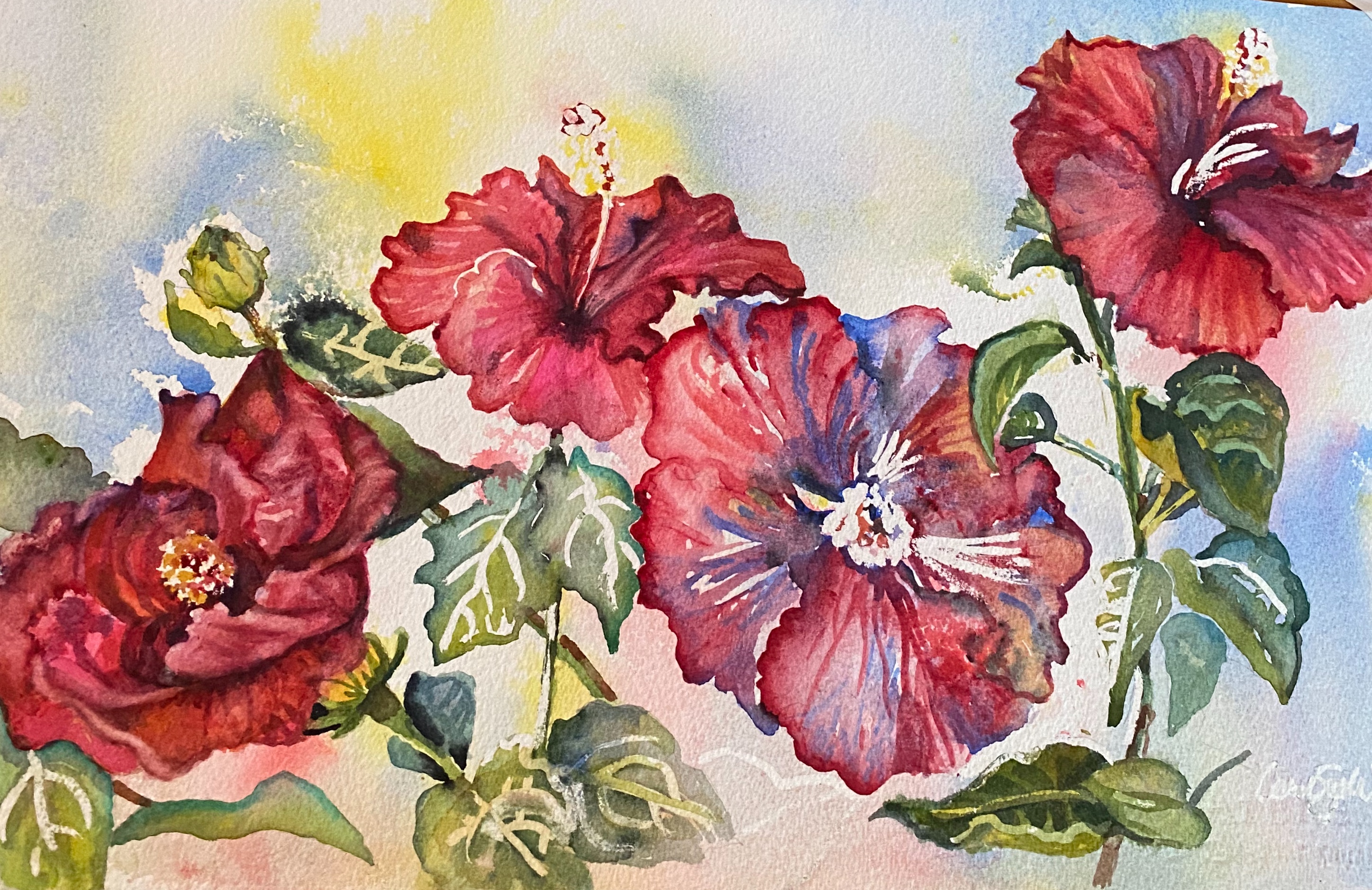
Let’s recreate my painting “ Hi Biscus”. This is my completed painting and one of my many reference photos taken from my back porch. I love these gorgeous plants! 

                                 
 If you follow my blog, you know I print a BW and color copy to refer to as I paint. BW creates an easy value study; I am all about shortcuts if they work.                                                        
The blooms, buds & leaves all had their own prominence in my design. I also chose to leave most of the obvious mask lines which are rather hard rather than soften them. They created a nice rhythm throughout the painting.

Working backward here are the tools I used:

11”x 22” Arches 140# paper taped

3 transparent colors (red, yellow and blue). Permanent rose, Lemon yellow and Prussian blue

3 brushes, 3 droppers

3 bowls, 3 stirrers

1 spray bottle

1 straw or atomizer

Masking fluid , if desired

I sketched my scene and masked ( blue lines are Pebeo masking fluid) a few spots to preserve the white of the paper . You do not have to do this but if you are quite sure of placement and values , as I was, this is a needed step. Not only do I have a ready made background for my floral but I also have beautiful patterns to play with in my leaves, stems and petals.


As I started painting, I played with each petal, stem and leaf separately to play up these lovely undertones.


This start is a very satisfying way to prevent you from staying in your comfort zone! You can’t control the outcome and that is a good thing. And there's no worrying about how to handle the background...it's done. 

 Here are a few more starts and finishes done in this manner:
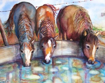
This one is titled 
Jump in, the Water’s Fine”

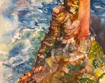
I sketched and masked this lighthouse scene and used the underpainting to help create rhythm and color in the water, rock and lighthouse. I held a very fun work shop using this scene and all attendees were pleased with their outcomes. Of course, all different because this is not possible to copy. It’s an individual, unique happening.


                                                                    “Snip, Snip” 

I was inspired by a basket of scissors I found in an antique shop in Fredericksburg. The underpainting really changed my game plan and it was a delightful experience that earned me a first place award in a Waterloo Watercolor Show in 2020.

I think you can see that my 3 colors were changed, they simply need to be transparent so I used violet as my red. Violet already is a combination of blue and red so this was a purposeful maneuver. I did add quinacridone red on later glazes.


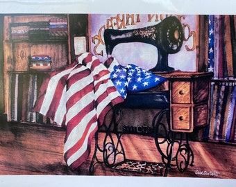
"What a Beautiful Sight..."


I hope this inspires you to start your watercolors in an exciting new way. I think you’ll enjoy it!

Now for a promised announcement of my next workshop: it will include the jump start you have just seen with 3 different transparent colors. It will be titled           "Catch a Wave” 
and will be held on March 10, 17 and 24th. These are my Watercolor Wednesdays and classes are held via Zoom from 12:00-2:00 + CST
This is the reference photo.  We will paint together but you have a week to accomplish what I demonstrate. Individual email critiques are included from me. I will provide a supply list and more details. Let me know if you would like to join me. Cost is $45


Zoom 2020

Have you added illumination to your watercolors?

 A little sparkle and shine can be a great addition to the normally dry and flat finished look of your watercolors. There are several techni...