Wednesday, February 17, 2021

Jump Start your watercolors....and more!

Notice: Waterloo Watercolor Group has rescheduled my live demo of this process that was to be aired on Thursday evening Feb 18th due to severe utility outages in the Austin Texas area . I will post the new date as soon as it’s available. 

 Jump In......

If you haven’t tried creating an underpainting for your paintings you may be missing an opportunity to enrich your colors , loosen up and/or get out of a slump. This method is not new but it escapes some beginners as well as advanced watercolorists because a) it’s scary b) you do give up some control and c) it’s not the way you usually start your paintings. Guess what? Those are all good reasons to try it. How else will you grow? It literally jump starts your creative processes whether you had already sketched a scene or you were not sure what to paint.

I was first introduced to a 3 color underpainting at a workshop given by Lian Quan Zheng in 2018. We actually painted this entire painting with just these 3 colors: Napthol Red, Hansa Yellow and Antwerp Blue. The key is their transparency as it allows the mixing and layering to occur resulting in a rich glow of hues. The transparency of a color is available on the tube and on the manufacturers website. I used a mix of brands but rely on Daniel Smith colors.  

My normal pattern had been to start a painting at the largest area like the sky in a landscape scene. Or I started at the top with a graded wash and worked down the paper for my first glaze. And my paintings were just fine. But I wanted to try some new tricks and this one has literally changed how I paint. I hope you will let me share this technique with you.


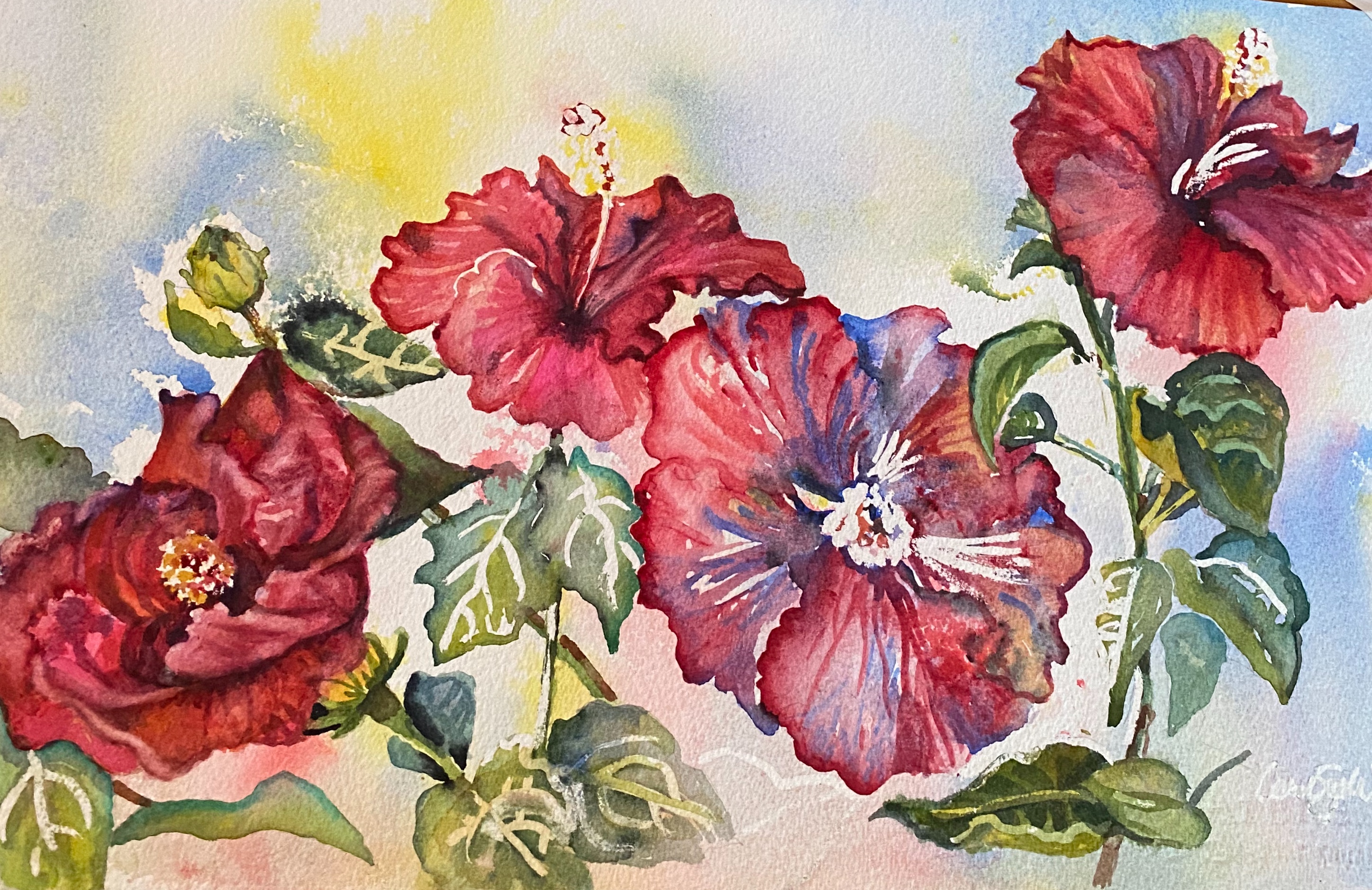
Let’s recreate my painting “ Hi Biscus”. This is my completed painting and one of my many reference photos taken from my back porch. I love these gorgeous plants! 

                                 
 If you follow my blog, you know I print a BW and color copy to refer to as I paint. BW creates an easy value study; I am all about shortcuts if they work.                                                        
The blooms, buds & leaves all had their own prominence in my design. I also chose to leave most of the obvious mask lines which are rather hard rather than soften them. They created a nice rhythm throughout the painting.

Working backward here are the tools I used:

11”x 22” Arches 140# paper taped

3 transparent colors (red, yellow and blue). Permanent rose, Lemon yellow and Prussian blue

3 brushes, 3 droppers

3 bowls, 3 stirrers

1 spray bottle

1 straw or atomizer

Masking fluid , if desired

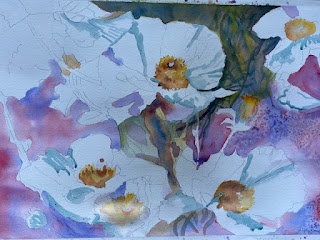
I sketched my scene and masked ( blue lines are Pebeo masking fluid) a few spots to preserve the white of the paper . You do not have to do this but if you are quite sure of placement and values , as I was, this is a needed step. Not only do I have a ready made background for my floral but I also have beautiful patterns to play with in my leaves, stems and petals.


As I started painting, I played with each petal, stem and leaf separately to play up these lovely undertones.


This start is a very satisfying way to prevent you from staying in your comfort zone! You can’t control the outcome and that is a good thing. And there's no worrying about how to handle the background...it's done. 

 Here are a few more starts and finishes done in this manner:
This one is titled 
“Jump in, the Water’s Fine”

I sketched and masked this lighthouse scene and used the underpainting to help create rhythm and color in the water, rock and lighthouse. I held a very fun work shop using this scene and all attendees were pleased with their outcomes. Of course, all different because this is not possible to copy. It’s an individual, unique happening.


                                                                    “Snip, Snip” 

I was inspired by a basket of scissors I found in an antique shop in Fredericksburg. The underpainting really changed my game plan and it was a delightful experience that earned me a first place award in a Waterloo Watercolor Show in 2020.

I think you can see that my 3 colors were changed, they simply need to be transparent so I used violet as my red. Violet already is a combination of blue and red so this was a purposeful maneuver. I did add quinacridone red on later glazes.


"What a Beautiful Sight..."


I hope this inspires you to start your watercolors in an exciting new way. I think you’ll enjoy it!

Now for a promised announcement of my next workshop: it will include the jump start you have just seen with 3 different transparent colors. It will be titled           "Catch a Wave” 
and will be held on March 10, 17 and 24th. These are my Watercolor Wednesdays and classes are held via Zoom from 12:00-2:00 + CST
This is the reference photo.  We will paint together but you have a week to accomplish what I demonstrate. Individual email critiques are included from me. I will provide a supply list and more details. Let me know if you would like to join me. Cost is $45


Friday, January 8, 2021

2021 Have you reflected lately? Take a look in my “Mirror , Mirror"

 First of all, my apologies...I  dropped off posting after September as the last months of 2020 took me in several very busy new directions , despite Covid. We left Texas in the over 100 degree heat that blankets this area in summer to spend time with our California family. They have a home in Pacific Grove with temps reaching a pleasant 70 degrees in the summer. As always, the experience and travel taught me how to look at literally everything with a new appreciation of the beauty all around me. 

I want to start 2021 with a renewed examination of reflections...are you interested?


I want to share the sequence of techniques and colors I used to create reflection in my current start of the year painting titled " Mirror, Mirror". Reflections are a mirrored image of the object they reflect and they create a wonderful opportunity to showcase what some may take for granted....light. I chose crystal because it is prismatic with sharp tiny slivers of changing color and value. 

I started by creating a scene with crystal objects in my home: a pitcher, two ornate decanters with glasses from Russia and Budapest and a crystal ash tray ( not from this girl but my parents both smoked). I love this bowl from that era which was likely made in Germany. The table reflected the glass just as I hoped.


            Take a close look at the prisms formed as light bounces in the cuts of the glass.


 Pebeo masking fluid (blue) was applied to my sketch to preserve the whites of the paper. Paper is Fabriano Artistico 140# 18" x24".

Next came my underpainting using a spray bottle and just red, yellow and blue. To be specific, Quinacridone Red, Cobalt Blue and Hansa Yellow. Next I decided to try Viridian Green rather than mix my greens due to its vibrancy and also added the warmer Quinacridone Gold to this group. It was a good decision.  I splashed a little of these same colors randomly then let it dry for a few hours.


Using a larger pointed round brush, I chose to paint some background shadows and also within each individual shape . I splattered each color again to add texture to my left background. My goal is always to have the 4 sides be different and if warm on top, cooler on the bottom or vice versa.


After drying I removed the masking fluid. It was probably on the paper for 3 days total and removed easily. Lots of white to play with ...


Time to zero in with a smaller brush on dry paper. I used a rigger or liner to add details in the crystal. And here I am as I write this at about 75% done....I will add the finished product so check my blog again in the next week.
  

This Uniball Signo pen then allowed the white fine lines. They are opaque , inexpensive and easy to use:

https://www.jetpens.com/Uni-ball-Signo-Broad-UM-153-Gel-Pen-White-Ink/pd/380

Let me know if you would like to be added to my email list for future work shops. We will meet on Zoom on "Watercolor Wednesdays" starting in mid February. Contact me at carolsuewitt@gmail.com for more details and cost.

Happy Painting!

Carol Sue

PS
We spent two months in California with the Pacific Ocean just 6 blocks away. The rocky coastline, crashing waves and skies that seemed to never end are all puzzling soothing to view and I'm anxious to attempt to capture the phenomenon on paper. It is a powerful, full of rhythm and life. Stay tuned for my painting of Asilomar Beach currently under construction which will include a lot of tiny rhythmic lines done with my Uniball pen. It's like making lace... only harder. But that's my next blog.
 Meanwhile I’m almost there... 
Am I done? Close


Here is a value study for you


Monday, September 7, 2020

Poster Art is on my mind....


  I  decided to take a closer look at advertising art. It uses color and bold shapes, borders and lettering to entice us to attend or want more of a certain subject. Along with bold colors, different sized pen nibs are also used to outline and dramatize designs. Motion Picture Studios have a long tradition of using their images to persuade attendance to upcoming movies using posters. and offer a lasting snapshot of the actors and maybe a scene or two. It’s also a great collectible. Many a home theater, college dorm room and early apartment has been decorated with these favorites.   

Lettering  has long been a favorite study of mine. I learned several calligraphic alphabets over the years and have used the wonderful families of majuscules and minuscules of our 27 letters to create my own stylized alphabet. I encourage the use of this skill especially if you don’t like your own hand writing...you can do better! 

The first poster will focus on the Texas music and wine scene that is alive and well  in the small town of Gruene ( pronounced GREEN). A water tower, a river and several old dance halls ( including Gruene Gall, the oldest in Texas) mark the spot where many come to party and dance or just walk around enjoying the local sights. The music is first class country and the wine offers all varieties from local wineries. This year, due to Covid, will be virtual and will benefit United Way.

This sketch was my first pass at the design. I anchored the upper left and lower right with a swirling confetti that just looks like fun. After masking with Pebeo masking fluid ( blue lines) , I created an underpainting. Lots of bright Hansa Yellow, Quinacridone Red and French Ultramarine Blue were thrown on sprayed areas , then blown with a straw and splattered. The river is a combination of Cobalt and French Ultramarine Blue. I used Elegant Writer pens with various nibs to create a black edge in places while continuing my color processes.

Something about the bucket of wine in the bottom right looked too busy so I did change this and repainted with the following result:


Still...I thought a musical ribboned border with catch phrases suggesting fun and giving for this excellent cause

So much fun and hopefully a donation item!

New discovery: white pens that actually are strong opaque accents can be used effectively with watercolors. After trying several I settled on the Uniball Signo (broad) made by Mitsubishi and readily available at Michael's. 


New technique?: Round Rock Arts Downtowner Gallery asked for our group to video a demo using wine as our medium. Here is a link to YouTube to see my effort which was also presented at a Waterloo Watercolor Group Meeting in early August.
                                                                    Cheers!


https://ms-my.facebook.com/RoundRockArtsCouncil/videos/painting-with-wine-by-artist-carol-sue-witt/2703246303252026/


Friday, July 10, 2020

Summertime...is apparently an "Ideal" time to paint in watercolor!


Sometimes it's just the simple scenes that are the most fun to paint. But let's be honest, this Ball jar vase with cut flowers (painted by another artist ) offers some complexities. That is what makes it an excellent project for a watercolor painting class. Not only do we have the background to create, but also water, stems, leaves and petals and a reflective glass jar. We have continued to use a Zoom class, as we are still social distancing, to create our end of June floral. Everyone was provided with a color and BW version of the image and instructions to have the scene sketched and masked before our class. I want to mention that there were 9 in attendance , including a family member,my daughter in law, Anne, and they ranged from new to watercolor to advanced painters just wanting to try some new techniques.I was especially pleased to have my longtime friend and fellow artist, Sue Rinker, primarily an oil painter join us for a little fun with another genre. 

 I usually demonstrate how to paint each area as my artists take notes or paint along. As each person completes their painting and sends it to me, I will add it to this blog.

Here are the images sent to each painter:
      Masking fluid ( Pebeo) is in blue and is used to save the white or lightest highlights.
 
  A Color copy is for reference
 Ideal...by the original artist


A masked sketch was homework for each artist prior to our class


A black and white copy is an easy value study and the most important road map to obtain 5 values.


We have a vocabulary list that is added to during each lesson and for this class, we covered the following as the background requires an understanding of watercolor washes::

Vocabulary

Wash: an area of paint applied to paper in a smooth, uniform zone or a subtle, changing tone

.Can be difficult (so practice these): used for backgrounds, sky, water scenes, mountains, sunsets, etc)

.Can be done on dry paper or wet in wet; I usually tilt my board to 30 degrees ; use a wash brush with an even horizontal stroke most times; make a puddle of enough of the color you are using

Graded: Darker fading to lighter in the same color

Flat:   Same tone and color throughout

Variegated: Gradual change from one color to another


Because our time was limited to a 3 hour session and the reality was that this particular painting would be completed on their own, I provided the following suggestions:

We will be using a variegated wash for the dramatic background of this Ball jar and flowers. As always, our goal is to have 5 values from white(lightest) to darkest value.

1.     Wet your previously masked page with clean water

2.      1. Using Hansa or Lemon Yellow place the undertones throughout your page

3.       Divide your page in half vertically and start in the upper left (darker) corner , working down that left side of the Ball jar. Instead of a horizontal stroke, use a more vertical pattern to obtain the look. We will use Permanent Rose and Cobalt ( and more yellow if needed) working wet in wet. You may come back later to add more darks.

4.      2. Moving to the upper right , mix orange ( permanent rose and yellow) and again work top to bottom using cerulean for a lighter dark

5.    3. Use quinacridone gold in the center of the Ball jar moving outside the edges. Begin the leafy foliage with mixes of sap green and yellow.

6.    Remove mask when all has dried.

7.    4. Create the metal edge of the handle and hardware with cerulean and burnt sienna and the lettering in cerulean and titanium white ( if needed) using a rigger or liner on dry areas. This is done with your rigger or liner anduses a calligraphic stroke.

8.    Begin adding your darks as needed ( French ultramarine and Prussian work well). Also Alzarin and cobalt for a rich dark red.


9.    5. Save the flowers for last: use #8 or# 10 pointed round:


Yellow flower: A milky base of quin gold or Hansa using a pointed round for the petal shapes ( follow their natural direction), adding permanent rose on tips and in darker areas for variation while wet.


Mauve flower: Permanent rose and cobalt or purple if you have it . Same brush strokes


6. Finish by adding your darks and lifting hard lines you don’t want…splatter the background with water, if you like.

 Enjoy!!

 I am always amazed with the outcomes. 

Here are a few finished images from two attendees,  Ron Weidmann  (Centennial, Colorado) and Susan Rinker ( Frisco, Texas):


Debbie Lauderdale, Austin, Texas


My advice to you and all who are creating an artistic point of view for others to enjoy;

Know the rules first, throw out the ones you don't like and paint like nobody's watching!


Tuesday, June 23, 2020

"Peonies" and "Fresh Cut" ....May and June 2020 Watercolor Wednesdays

Peonies ( continued)

Well, since the pandemic is keeping us at home for awhile, we decided to continue meeting this way. There is a value to having more time to absorb the information and paint. Our May class, as usual was a combination of beginner and advanced watercolor artists  local Texans and also from Colorado who completed this lovely artwork. We did an under painting using 3 colors: Hansa Yellow, Permanent Rose and Cobalt Blue as well as salt for texture before defining the leaves and stems, later soft petals and centers. The outcomes were all good. I suggested note cards ( easy using Vistaprint,  Shutterfly and other online sources ) and I am happy to say some went forward with this idea. Here are my notes and images.


    A transfer sketch was made available to all painters using a grid


    The softer blue lines are Pebeo masking fluid ( my reco)


After the background was added, we got up close and personal with our darks to make the white petals pop.


My completed painting:


June work shop "Fresh Cut"

   Using my reference photos of a colorful flower shop taken in Aptos, California in 2019, we created a very easy value study by copying this in B/W. Both were used for decision making during the class.


We used complementary colors and our goal was 5 values in this painting. We tried to convey 4 textures: stone, water, tin and living plant material with one medium, watercolor.


                             10 values from white to black

     Transfer sketch ( sign or not) was easily done on any size paper. 11 x 15 is most popular due to over the counter framing capabilities.


And here is our distinguished online Gallery of completed paintings:

Please notice choices of color, additions and deletions, heavy and light applications of pigment and.....personality. The teacher, as always, learned from her class!

 Monica Donna


Sue                                                                                                Debbie


                                                                                                                                                  Carol                    


Rene                                                              Georgia


Lu
                                                                                                       Mary                            
Please join me in congratulating these artists who have managed to convey a lively scene filled with a variety of textures and values. Leave a message for an artist here and feel free to share.


Sunday, May 10, 2020

Art while social distancing Zoom, Zoom...welcome to Spring 2020

I was planning two exciting work shops. One as the featured watercolor artist in Bastrop, Texas at Lost Pines Art Center during a long week-end in March and the other in Marble Falls in early April. Both had nice sized classes arranged and I was prepared when ...oops!  along came a pandemic. There go the best made plans and those preparations were no longer needed. Eventually both events were reluctantly cancelled along with two planned trips, one to Nashville and one to San Francisco.  Needless to say, everyone's plans were changed! That, as it turned out, was the least of our concerns. Many were afflicted and died, many in the healthcare industry became beyond overworked, many lost jobs, many ( who knew?) were living on the brink and required immediate assistance even with their next meal. No schooling, no graduations, no airline travel, cruising is OUT....it all ground to a complete and lengthy HALT. Grocery stores were wiped out, toilet paper and meat now rationed and smog lifted from the skies due to a lack of emissions left the air in its best state in decades all over the world.  No cure, no real rhyme or reason but corona virus, Covid 19 has taken over. Thank God New York had Mario Cuomo leading them as they were hardest hit. Turns our high rises and mass transit may not be best. We are just now testing the waters of reopening but this has changed forever how we will do things....

For those of us who simply had to stay at home, wash hands and not touch our faces, this has not been as horrendous.  We can take a walk in the fresh air, read books, stream movies and gain weight. But we do have whiners who don't want to wear a mask, including our Vice President (?????) while at the Mayo Clinic no less! But lets wish them well in Washington because our lives literally depend on them. And let's look on the brighter side:

1.  I  was quick to volunteer to teach an art class online via Zoom in late March to my 3rd grade grandchildren, Ella and Gray,  in the Bay Area. The class size quickly grew to 14 at times with classmates and their siblings joining in. We are currently ( week 5) working on a book that will be written and illustrated by each of them. Lots of fun on Fridays. Hopefully their books will be lifelong reminders of this time.


2. My friend and owner of Art School Marble Falls , Debbie Heatley, asked if I would like to teach my work shops online also via Zoom so we divided the normally 6 hour day into 3 Watercolor Wednesdays  per month and had some different interaction. The pros of this are that each student has the entire week to work on their paintings before we meet again.


    Barns, Bluebonnets and Babies....featuring Speckles and her calf was painted on April and we are doing a floral in May.


Using a favorite published procedure, I added some shapes and colors to this lovely poppy painting. Thank you , Lu, for the images of your longhorns.

                                         
and here is our May floral , Poppies:


                                      Graphite transfer for 15 x 22 Arches 140# paper

                                          Masked areas

First wash for background war Permanent Rose and French Ultramarine by Daniel Smith.

                                                    Stay tuned for the finished product.

3.   And last but not least, I qualified for entry as a signature member in Texas Watercolor Society! The show is being held in Ingram Texas but is available online at www.texaswatercolorsociety.org. I am so honored! Juror Judi Coffey selected my entry
 " Low Water Crossing" to be shown along with 38 other artists. All my future works will have TWS proudly displayed after my signature.


Please visit my Etsy store, Watergirl Art for in stock prints from me or have all sizes and even canvas prints of my art made at Fine Art America!

                                                                             Be well!

Zoom 2020

Summer Lessons....Bees and Blooms

 I taught a class to my 5 summer artists and we all loved the delicate wings and petals in this scene. Our goal was to use iridescent waterc...